Landing Page Media & Layout Refinement
Replaced placeholder codeblocks with authentic high-resolution screenshots of the dashboard, CLI, and MCP. Optimized mobile grid spacing and responsive hero layouts.
#Landing Page Media & Layout Refinement
We completely overhauled the media assets on the landing page, replacing the early placeholder mockups with authentic, high-resolution visual previews of the platform.
#Authentic Screenshots
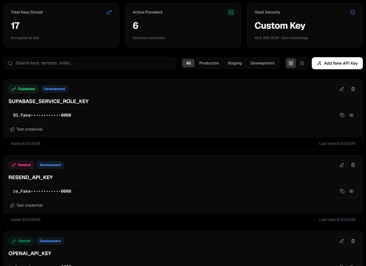
Hero Dashboard
A stunning, frameless high-contrast media card showcasing the exact Web App interface.
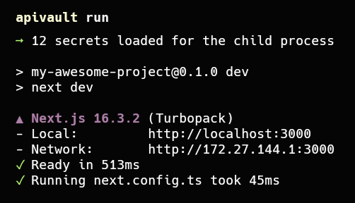
CLI Runtime Injection
A realistic terminal preview demonstrating the apivault run command injecting secrets directly into a Node.js process.
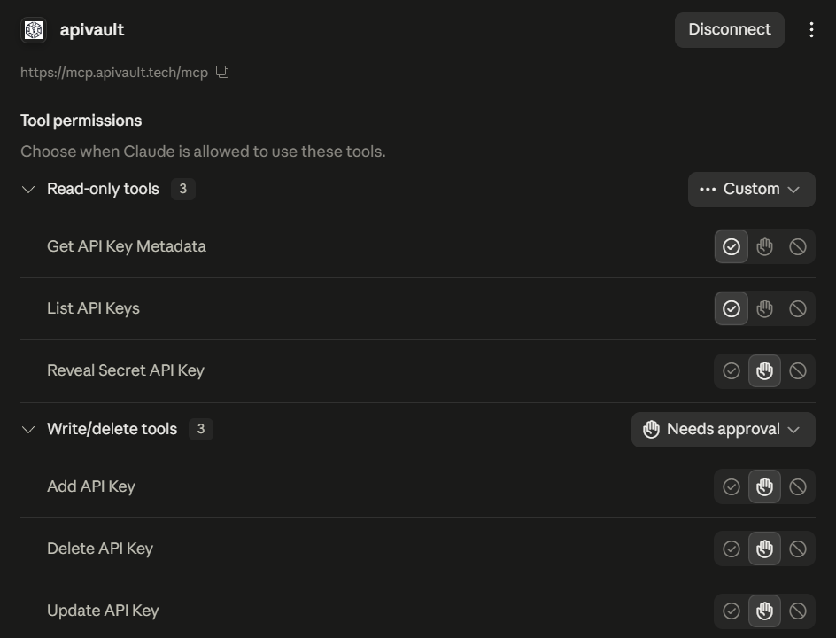
Remote MCP Authorization
A clean visual of the Model Context Protocol connecting securely with AI coding agents.
We also refined the mobile grid spacing and optimized the hero CTAs so the landing page looks incredible on smartphones and tablets.